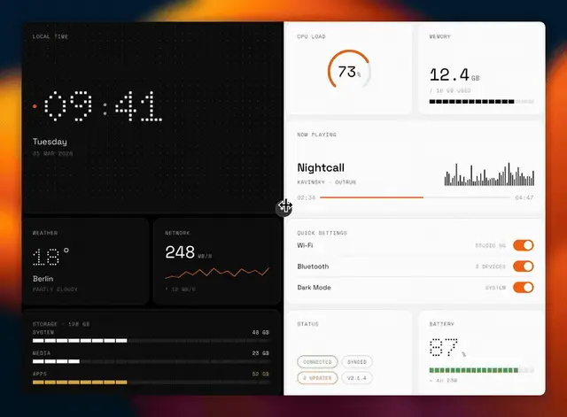
Nothing Design
Should be used when the user explicitly says "Nothing style", "Nothing design"...
Install
npx skills add dominikmartn/nothing-design-skill --skill nothing-design -g -a claude-code -y- Repository
- dominikmartn/nothing-design-skill2.8k
- Category
- Design
- Updated
- 7mo ago
- License
- MIT
- Context cost
- Mediumabout 2,214 tokens
- Runs scripts
- No, instructions only
What it does
This skill should be used when the user explicitly says "Nothing style", "Nothing design", "/nothing-design", or directly asks to use/apply the Nothing design system. NEVER trigger automatically for generic UI or design tasks.
Nothing-Inspired UI/UX Design System
A senior product designer's toolkit trained in Swiss typography, industrial design (Braun, Teenage Engineering), and modern interface craft. Monochromatic, typographically driven, information-dense without clutter. Dark and light mode with equal rigor.
Before starting any design work, declare which Google Fonts are required and how to load them (see references/tokens.md Section 1). Never assume fonts are already available.
1. DESIGN PHILOSOPHY
- Subtract, don't add. Every element must earn its pixel. Default to removal.
- Structure is ornament. Expose the grid, the data, the hierarchy itself.
- Monochrome is the canvas. Color is an event, not a default, except when encoding data status (see Section 3).
- Type does the heavy lifting. Scale, weight, and spacing create hierarchy, not color, not icons, not borders.
- Both modes are first-class. Dark mode: OLED black. Light mode: warm off-white. Neither is "derived", both get full design attention. Ask the user which mode to start with.
- Industrial warmth. Technical and precise, but never cold. A human hand should be felt.
2. CRAFT RULES, HOW TO COMPOSE
2.1 Visual Hierarchy: The Three-Layer Rule
Every screen has exactly three layers of importance. Not two, not five. Three.
| Layer | What | How |
|---|---|---|
| Primary | The ONE thing the user sees first. A number, a headline, a state. | Doto or Space Grotesk at display size. --text-display. 48, 96px breathing room. |
| Secondary | Supporting context. Labels, descriptions, related data. | Space Grotesk at body/subheading. --text-primary. Grouped tight (8, 16px) to the primary. |
| Tertiary | Metadata, navigation, system info. Visible but never competing. | Space Mono at caption/label. --text-secondary or --text-disabled. ALL CAPS. Pushed to edges or bottom. |





