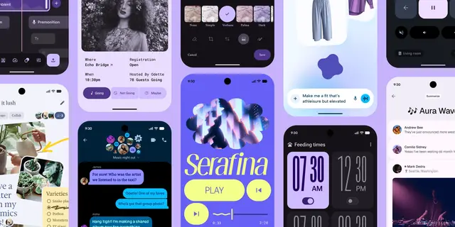
Material 3
Implement Google's Material Design 3 (Material You) UI system.
Install
npx skills add hamen/material-3-skill --skill material-3 -g -a claude-code -y- Repository
- hamen/material-3-skill1.5k
- Category
- Design
- Updated
- 4mo ago
- License
- MIT
- Context cost
- Mediumabout 3,000 tokens
- Runs scripts
- No, instructions only
What it does
Implement Google's Material Design 3 (Material You) UI system. Primary: Jetpack Compose Material3 (MaterialTheme, components, adaptive layout). Also Flutter and limited web (@material/web, maintenance mode). Covers tokens, 30+ components, layout, theming, M3 Expressive (platform matrix), and accessibility. Use when: "material design", "MD3", "material you", "Jetpack Compose", "MaterialTheme", "material component", "md3 button".
Material Design 3
This skill guides implementation of Google's Material Design 3 (MD3), a personal, adaptive, expressive design system. MD3 uses dynamic color, tonal surfaces, rounded shapes, and spring-based motion to create UIs that feel alive and personal.
Philosophy
MD3 is built on three principles:
- Personal: Dynamic color adapts UI to the user's wallpaper or content. Theming is individual, not one-size-fits-all.
- Adaptive: Layouts transform across 5 window size classes. Components resize, reposition, and change form factor responsively.
- Expressive: Shape morphing, spring physics, and emphasized typography create moments of delight without sacrificing usability.
Current Updates: Google I/O 2026
Material's Google I/O 2026 update reinforces a Compose-first Android path and expands expressive/adaptive guidance:
- Material Android is Compose-first: For new Android work, prefer Jetpack Compose Material3 for the latest components, expressive APIs, adaptive scaffolds, and Styles API integration. Android Views may remain necessary in existing apps, but they should not be treated as the default path for new Material 3 implementations.
- Expressive layout system: Use an expressive layout scaffold to adapt screens across mobile, desktop, foldables, watches, XR, and other spatial form factors. Start from adaptive scaffolds/window size classes instead of fixed phone-first layouts.
- 8dp spacing system: Apply spacing tokens for margins, padding, and gaps so layouts and components can adapt programmatically to device type and density.
- New/updated expressive components: Lists, menus, search, and search app bars have refreshed expressive guidance, with Jetpack Compose as the primary implementation target.
- Watches and XR: Watches emphasize physics-based motion, arc text, and edge-hugging containers. XR emphasizes spatial panels and depth-based elevation.





